Plotting & Analysis
Goal
In this tutorial you will visualise simulation results using the MQED plotting commands. Available plots include mean squared displacement (MSD), square-root MSD, inverse participation ratio (IPR), participation ratio (PR), and a field-enhancement comparison across different inputs.
By the end you will know how to:
run each
mqed_plot_*/mqed_compare_*command,configure single-curve and multi-curve plots via YAML,
customise axis limits, fonts, colours, and output format.
Prerequisites
Make sure you have installed the package and activated the environment as described in Installation.
Depending on which plots you want to generate, you may need cached output from earlier pipeline stages:
Field enhancement results — see Field Enhancement.
Quantum dynamics results — see Quantum Dynamics.
Tip
The example data ships with the repository under data/example/.
You can run any plot command out of the box without prior simulation runs.
Quick start
Plot the mean squared displacement with default settings:
mqed_plot_msd
Other plot types follow the same pattern:
mqed_plot_sqrt_msd
mqed_plot_IPR
mqed_plot_PR
mqed_compare_enhancement
Customising the run
Override individual parameters on the command line using Hydra syntax:
mqed_plot_msd plot_settings.xlim=[0,200] plot_settings.dpi=300
Use a different YAML in the same config directory
(configs/plots/):
mqed_plot_msd --config-name=my_msd
Use a YAML from an arbitrary directory:
mqed_plot_msd --config-dir=/path/to/my/configs --config-name=my_msd
The same flags work for all plot commands (mqed_plot_sqrt_msd,
mqed_plot_IPR, mqed_plot_PR, mqed_compare_enhancement).
Tip
You can combine --config-name (or --config-dir) with individual
parameter overrides:
mqed_plot_msd --config-name=my_msd plot_settings.ylim=[0,500]
Available plot commands
Command |
Description |
|---|---|
|
Plot mean squared displacement over time. Supports single-curve and multi-curve modes. |
|
Plot square-root MSD over time (same curve options as MSD). |
|
Plot inverse participation ratio (same curve options as MSD). |
|
Plot participation ratio (same curve options as MSD). |
|
Compare field enhancement across different data inputs (same curve options as MSD). |
Configuration reference
All plot commands share the same YAML structure. The example below shows
the MSD configuration (configs/plots/msd.yaml).
Curve definitions
Single-curve example
curves:
  - label: "planar"
    use_latest_glob: "${oc.env:MQED_ROOT,${hydra:runtime.cwd}}/data/example/QD_data/height_8nm/intermol_8nm/Fresnel_silver_planar_665nm_N30.hdf5"
    style: "-"              # matplotlib line-style string
    lw: 1.5
Multi-curve example
curves:
  - label: "Planar (All)"
    use_latest_glob: "${oc.env:MQED_ROOT,${hydra:runtime.cwd}}/data/example/QD_data/height_8nm/intermol_8nm/Fresnel_silver_planar_665nm_N30.hdf5"
    style: "-"
    lw: 2
    color: "blue"

  - label: "Planar (NN)"
    use_latest_glob: "${oc.env:MQED_ROOT,${hydra:runtime.cwd}}/data/example/QD_data/height_8nm/intermol_8nm/Fresnel_silver_planar_665nm_N30_NN.hdf5"
    style: "--"
    lw: 2
    color: "blue"

  - label: "Nanorod (All)"
    use_latest_glob: "${oc.env:MQED_ROOT,${hydra:runtime.cwd}}/data/example/QD_data/height_8nm/intermol_8nm/BEM_silver_nanorod_665nm_N30.hdf5"
    style: "-"
    lw: 2
    color: "orange"

  - label: "Nanorod (NN)"
    use_latest_glob: "${oc.env:MQED_ROOT,${hydra:runtime.cwd}}/data/example/QD_data/height_8nm/intermol_8nm/BEM_silver_nanorod_665nm_N30_NN.hdf5"
    style: "--"
    lw: 2
    color: "orange"
Plot settings
plot_settings:
  save_plot: true
  geometry: nanorod             # e.g. 'sphere', 'planar'
  material: silver
  excitation_position_nm: initial
  filename: "${plot_settings.geometry}_${plot_settings.material}_${plot_settings.excitation_position_nm}_msd_comparison_NN.png"
  dpi: 400
  show: false
  tight_layout: true
  grid: false
  legend: true
  figsize: [8.0, 6.0]          # [3.35, 2.4] for ACS single-column

  # Time window — choose ONE of x_range_ps or x_index_range
  x_range_ps: [0.0, 150.0]     # in picoseconds
  # x_index_range: [0, 500]

  # Axis labels, scales, limits
  xlabel: "t (ps)"
  ylabel: "MSD (nm$^2$)"
  title: null                   # or custom, e.g. "Silver; Middle Excitation"
  xscale: linear                # or "log"
  yscale: linear                # or "log"
  xlim: [0, 150]                # null for automatic
  ylim: [0, null]               # null for automatic

  # Font settings
  font:
    family: null                # e.g. "DejaVu Sans", "Times New Roman"
    labelsize: 18
    ticksize: 22
    legendsize: 18
    titlesize: 22
    labelweight: bold
    legendweight: bold
    tickweight: bold

  # Scientific notation on the y-axis
  y_sci:
    enabled: true
    style: "sci"                # "sci" → 1×10^n ; "plain" → normal
    scilimits: [0, 0]
    use_math_text: false
    offset_text_size: 20
    offset_text_weight: "bold"

  x_scale_factor: 1.0           # 1e-12 to convert ps → s
  lw: 1.6
Parameter |
Description |
Default |
|---|---|---|
|
List of HDF5 data sources with label, style, line width, and optional colour. |
(see YAML above) |
|
Time window for the x-axis in picoseconds. |
|
|
Figure width and height in inches. |
|
|
Resolution of the saved figure. |
|
|
Toggle background grid lines. |
|
|
Scientific notation formatting for the y-axis. |
enabled, |
Comparing field enhancement across simulations
The compare_enhancement command applies the same field-enhancement
analysis introduced in Field Enhancement, but extends it to
multiple simulation results at once. Instead of analysing a single
Green’s function file, you list several curves — each pointing to a different
HDF5 cache — so you can compare, for example, different emitter heights or
geometries on a single plot.
The configuration file (configs/BEM/compare_enhancement.yaml) shares the
same curve / plot-settings structure as above, but adds gf_settings for
dipole orientations and optional vertical reference lines:
gf_settings:
  x_key: Rx_nm
  energy_index: 0
  dipoles:
    donor: {theta_deg: 0.0, phi_deg: 0.0}
    acceptor: {theta_deg: 0.0, phi_deg: 0.0}

curves:
  - label: "Plane 2nm"
    use_latest_glob: "${oc.env:MQED_ROOT,${hydra:runtime.cwd}}/data/example/GF_data/Fresnel_GF_planar_Ag_height_2nm_665nm.hdf5"
    components: [real]
    style_real: "-"
    style_imag: "--"
    color: "blue"
    lw: 2.0

  - label: "Plane 5nm"
    use_latest_glob: "${oc.env:MQED_ROOT,${hydra:runtime.cwd}}/data/example/GF_data/Fresnel_GF_planar_Ag_height_5nm_665nm.hdf5"
    components: [real]
    style_real: "-"
    style_imag: "--"
    color: "orange"
    lw: 2.0

  - label: "Plane 8nm"
    use_latest_glob: "${oc.env:MQED_ROOT,${hydra:runtime.cwd}}/data/example/GF_data/Fresnel_GF_planar_Ag_height_8nm_665nm.hdf5"
    components: [real]
    style_real: "-"
    style_imag: "--"
    color: "red"
    lw: 2.0

plot_settings:
  vlines:
    enabled: true
    xs: [3, 6]
    colors: ["tab:red", "tab:green"]
    style: "--"
    lw: 1.5
    alpha: 0.8
Note
The vlines block adds vertical dashed reference lines at the
specified x-positions (3 nm and 6 nm in this example). Use them to
highlight specific donor–acceptor distances of interest — for instance,
nearest-neighbour separations or experimentally relevant spacings.
Expected output
After the command finishes, a PNG figure is saved to the Hydra output
directory (outputs/plot_msd/.../).
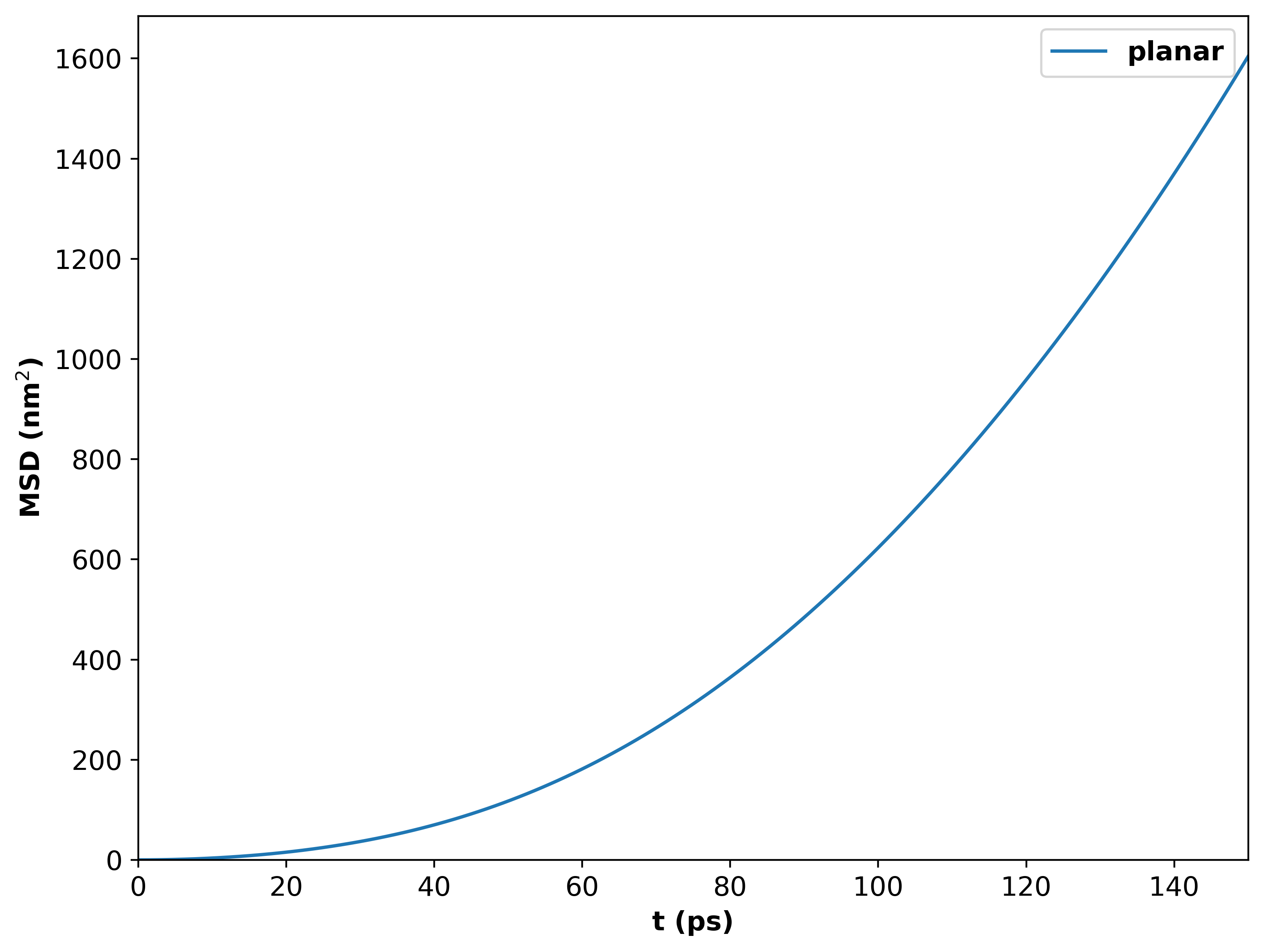
MSD vs time for 100 emitters above a silver surface. Emitters are oriented at the magic angle in the XY plane.
For multiple curves of nanorod, a PNG figure should look like:
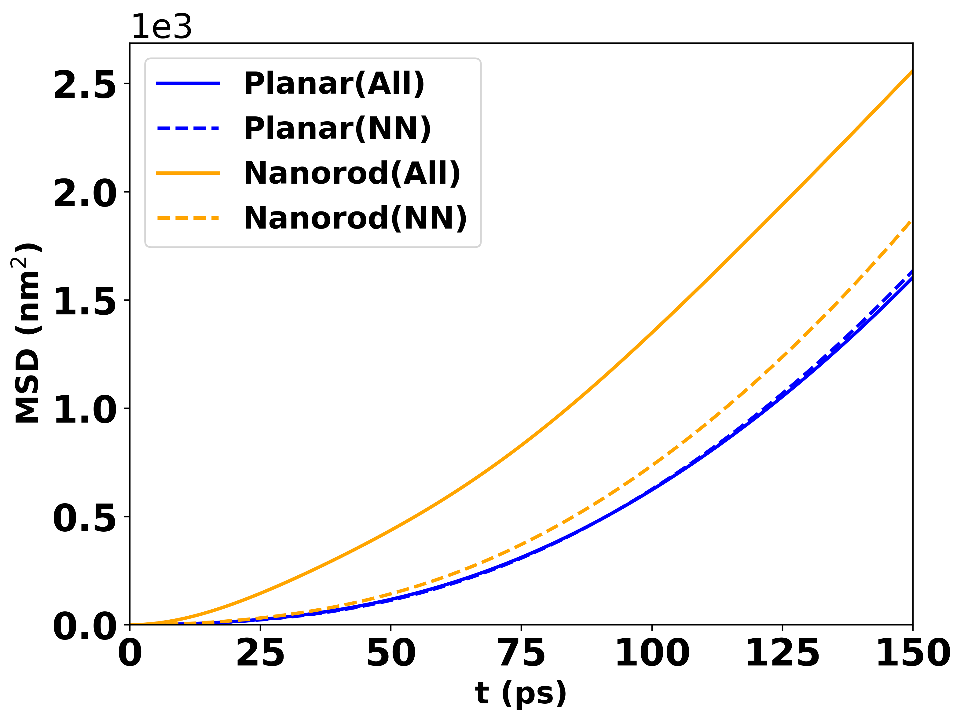
MSD vs time for 30 emitters above a nanorod with height 8 nm and intermolecular distance 8 nm.
The participation ratio (PR) starts from 1, so you will typically set:
plot_settings:
  ylim: [1, null]
The same multi-curve data produces a PR plot like:
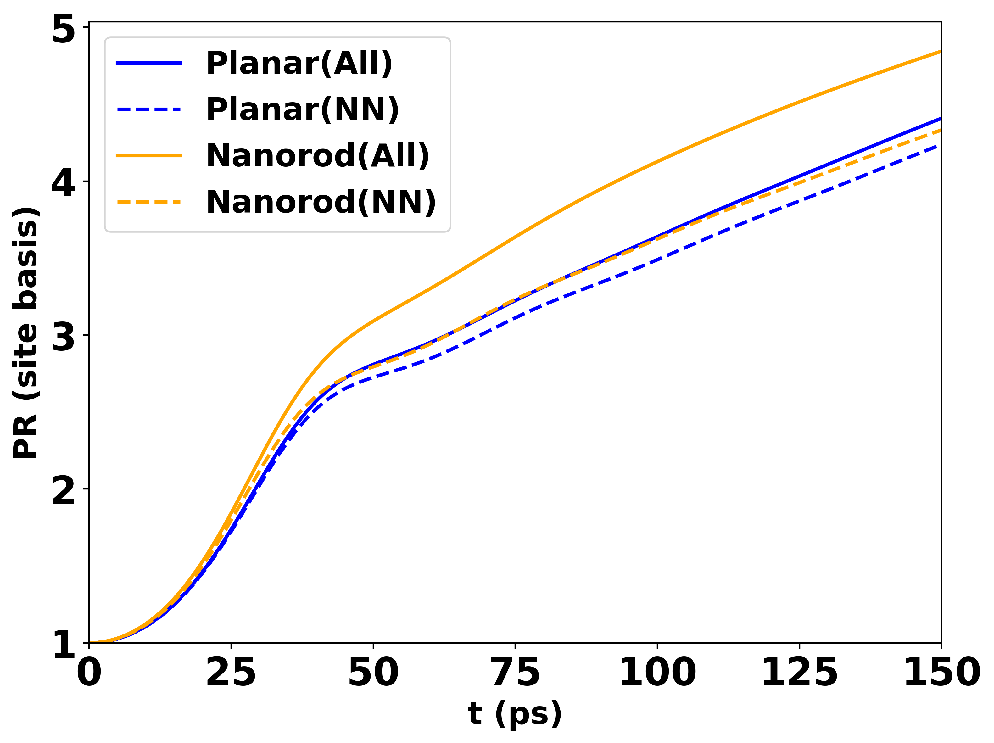
PR vs time for 30 emitters above a nanorod with height 8 nm and intermolecular distance 8 nm.
The compare_enhancement.yaml configuration produces a plot like:
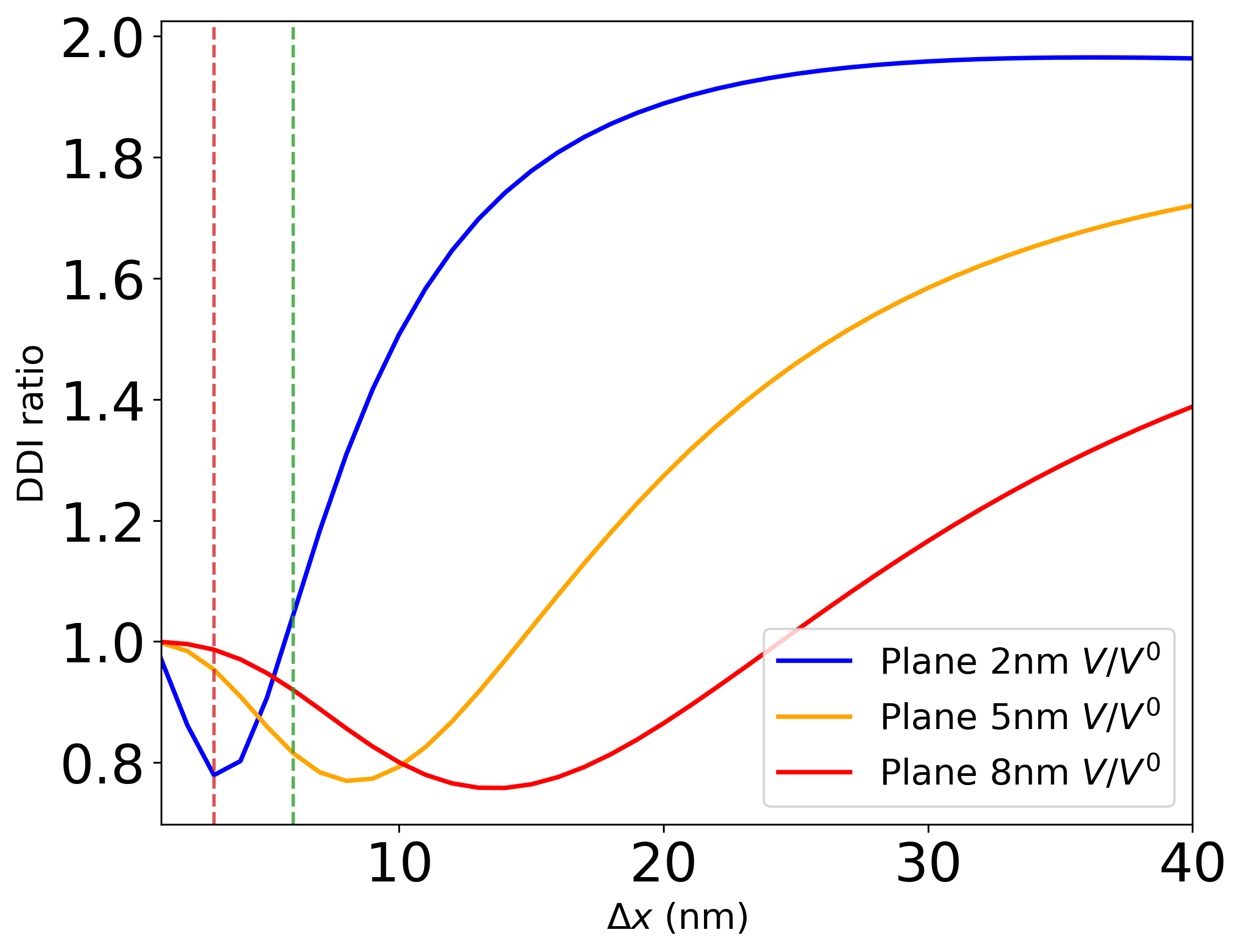
Field enhancement comparison for planar silver at different heights (2 nm, 5 nm, 8 nm). Donor and acceptor are oriented along the z-direction (H-aggregate). Vertical dashed lines indicate specific donor–acceptor distances of interest.
What’s next?
Getting Started — return to the workflow overview.
Dyadic Green’s Function via Sommerfeld Integrals — re-run with different spectral parameters to explore new regimes.